
143 E1.06: Graphs Part 2
Example 9. Just by sketching some more of the graph, estimate the y-value of [latex]y=4+2{{(x-3)}^{2}}[/latex] when [latex]x=14[/latex].
Solution: Extend the graph a bit and find that it appears to give [latex]y=250[/latex].
Check: Check this by plugging [latex]x=14[/latex] into the formula, [latex]y=4+2{{(x-3)}^{2}}=4+2{{(14-3)}^{2}}=4+2{{(11)}^{2}}=246[/latex]
Example 10. Use the graph to estimate which x gives the lowest value for y when [latex]y=4+2{{(x-3)}^{2}}[/latex] on the values [latex]0\le{x}\le12[/latex].
Solution: That x-value is clearly between 0 and 5. It appears to be a bit above halfway. So we estimate that it is about [latex]x=3[/latex].
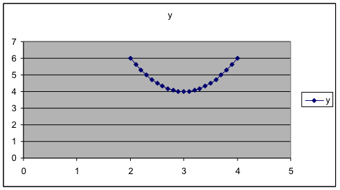
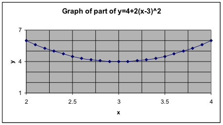
Example 11. Let’s “magnify” the portion of the graph near [latex]x=3[/latex] in order to see very precisely where the minimum value is. Actually, we leave the old dataset and graph alone and produce a new one. This time, we’ll just use x values near 3. So we’ll graph [latex]y=4+2{{(x-3)}^{2}}[/latex] on the values [latex]2\le{x}\le4[/latex] where we increase the x-values in increments of 0.1. Use the same technique as before. Here is the middle part of the data table and the graph. This makes clear that [latex]x=3[/latex] gives the minimum value for y.
|
 |
Check: To see that this is right, plug in and find the y-value. Then plug in a couple of other x-values close by and see if their y-values are lower or higher.
So [latex]x=3[/latex] and then [latex]y=4+2{{(x-3)}^{2}}=4+2{{(3-3)}^{2}}=4+2{{(0)}^{2}}=4[/latex]
Now [latex]x=3.02[/latex] and then [latex]y=4+2{{(x-3)}^{2}}=4+2{{(3.02-3)}^{2}}=4+2{{(0.02)}^{2}}=4.0008[/latex]
Now [latex]x=2.99[/latex] and then [latex]y=4+2{{(x-3)}^{2}}=4+2{{(2.99-3)}^{2}}=4+2{{(0.01)}^{2}}=4.0002[/latex]
These make it clear that the value of y at is smaller than the value of y at values for x near 3. Putting that together with what we saw on the graph, it is very clear now that [latex]x=3[/latex] is the correct answer.
Example 12. Optional: Changing the titles, labels, and scale along the axes.
In Example 4, we might prefer to have a graph with more labels, more grid lines, and different scales for the axes. Here is the result we want and how to obtain it in Excel. This may be done differently or may not be possible in other spreadsheet programs.
 |
While making the graph, in Step 3 of 4, click on some of the tabs at the top and change something. Titles: Put the labels you want. Gridlines: Check all four boxes for major and minor gridlines for both variables. Legend: Uncheck “Show Legend.” After the graph is made, move your cursor on top of some value on the x-axis and double click. In the resulting box, choose the Scale tab and then fill in the four boxes. I used 2 to 4, with major gridlines at 0.5 and minor gridlines at 0.25. Then do the same thing for the y-axis, but from 1 to 7, with major gridlines at 3 and minor gridlines at 1. |
