91 M1.06: Logarithmic Graphs Part I
Section 3: Logarithmic graphs
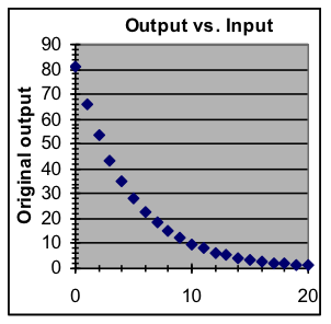
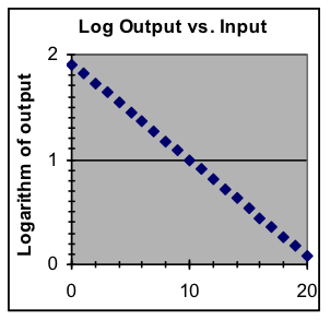
Data that follows an exponential model is particularly well suited to logarithmic compression, because in that case the graph of the logarithms of the output values will form a straight line. Also, exponential data that covers several half-lives or doubling times will be more easily examined in the logarithmic form.
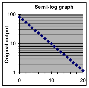
The display advantages of the logarithmic graph can be combined with the convenience in the original graph of having the scale on the left in the same form as the data. This is done with semi-log graphs, in which the logarithmic graph is displayed but the numbers shown in the y scale on the left are original, pre-logarithm values. The horizontal lines and numbers labeling them are placed at the vertical position that matches the corresponding logarithm.
To make a semi-log graph, first make a regular graph, then format the y axis:
- click on the vertical scale to select it,
- use Format > Selected Axis to display the Format Axis dialog box,
- click on the Scale tab to show the axis settings,
- put a check in the Logarithmic Scale box near the bottom.
|
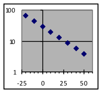
Example 5: Make semi-log graphs of these three datasets.
 
|
| x |
y |
| 1 |
4.1 |
| 2 |
5.5 |
| 3 |
7.4 |
| 4 |
10.0 |
| 5 |
13.5 |
| 6 |
18.2 |
| 7 |
24.5 |
| 8 |
33.1 |
|
| x |
y |
| 10 |
2 |
| 20 |
5 |
| 30 |
15 |
| 40 |
47 |
| 50 |
145 |
| 60 |
449 |
| 70 |
1,394 |
| 80 |
4,329 |
|
| x |
y |
| -20 |
67.9 |
| -10 |
45.1 |
| 0 |
30.0 |
| 10 |
19.9 |
| 20 |
13.3 |
| 30 |
8.8 |
| 40 |
5.9 |
| 50 |
3.9 |
|
| Example 6: For this exponential dataset, make a graph of the logarithms of the y data values and use that graph to estimate what y value is to be expected for an x value of 65. |
Show Answer
- Copy the data to a blank worksheet, putting x values in column A and starting the numbers in row 3. Then add a third column of logarithm values by setting cell C3 to “=LOG10(B3)” and spreading that formula down beside all the data rows.
- Now make a scatter plot of columns A and C (but not B). This will plot x on the horizontal axis against the logarithm of y on the vertical axis, forming a straight line.
- By finding what place on that line is above the x=65 position, we can estimate that the logarithm of y for that case is about 2.8. By evaluating 102.8 (with either a calculator 10x key or the “=10^2.8” spreadsheet formula), we find that the answer is about 630.
|
| x |
y |
| 0 |
26 |
| 10 |
69 |
| 20 |
181 |
| 30 |
482 |
| 40 |
1,279 |
| 50 |
3,393 |
| 60 |
9,002 |
| 70 |
23,885 |
|
Example 7: One of these datasets has an exponential-growth pattern, while the other has a quadratic pattern (i.e., part of a parabola) whose shape is different but close enough that it is difficult to tell just by looking at the graphs. Use graphs of the logarithms of the y values to identify which dataset is exponential.
Show Answer
For each dataset, copy the data to a worksheet, add a third column that shows the logarithms of the y values, and make a scatter plot of the x values and those logarithms. Examine the two graphs (copies shown below) to see which one is a straight line, indicating that its original data was exponential. The graphs show that dataset B is exponential and dataset A is not exponential. 
|
| Dataset A |
| x |
y |
| 0 |
3.5 |
| 2 |
4.1 |
| 4 |
6.1 |
| 6 |
9.3 |
| 8 |
13.7 |
| 10 |
19.5 |
| 12 |
26.5 |
| 14 |
34.9 |
| 16 |
44.5 |
| 18 |
55.3 |
| 20 |
67.5 |
| 22 |
80.9 |
|
| Dataset B |
| x |
y |
| 0 |
3.6 |
| 2 |
4.8 |
| 4 |
6.4 |
| 6 |
8.4 |
| 8 |
11.1 |
| 10 |
14.7 |
| 12 |
19.5 |
| 14 |
25.8 |
| 16 |
34.1 |
| 18 |
45.0 |
| 20 |
59.6 |
| 22 |
78.8 |
|