51 Consumer & Producer Surplus
Learning Objectives
- Explain, calculate, and illustrate consumer surplus
- Explain, calculate, and illustrate producer surplus
- Explain, calculate, and illustrate social surplus
Demand, Supply and Efficiency
The familiar demand and supply diagram holds within it the concept of allocative efficiency. One typical way that economists define efficiency is when it is impossible to improve the situation of one party without imposing a cost on another. Conversely, if a situation is inefficient, it becomes possible to benefit at least one party without imposing costs on others.
Efficiency in the demand and supply model has the same basic meaning: the economy is getting as much benefit as possible from its scarce resources and all the possible gains from trade have been achieved. In other words, the optimal amount of each good and service is being produced and consumed.
Consumer Surplus, Producer Surplus, Social Surplus
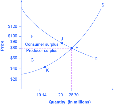
Consider a market for tablet computers, as shown in Figure 1. We usually think of demand curves as showing what quantity of some product consumers will buy at any price, but a demand curve can also be read the other way. If we choose a quantity of output, the demand curve shows the maximum price consumers would be willing to pay for that quantity. According to the demand curve in Figure 1, if producers wanted to sell a quantity of 20 million tablets, some customers are willing to pay $90 each (see point J.) In other words, a tablet is worth $90 to those customers.

However, that doesn’t mean that those customers will end up paying $90. Figure 1 shows that the equilibrium price is $80 and the equilibrium quantity is 28 million tablets. At that price, each customer who would have been willing to pay $90 for a tablet is getting a good deal. We all know what a good deal is—it’s when you get something for less than you think it’s worth. We don’t have to stop there. If suppliers chose to produce only 14 tables (as shown in point K), we can look at Figure 1 and up to the demand curve to see that some customers would have been willing to pay about $115 for a tablet at this quantity produced. What that means is that this subset of customers got an even better deal at the equilibrium price.
The demand curve shows what consumers are willing to pay for any given quantity of tablets. In other words, the height of the demand curve at any quantity shows what some consumers think those tablets are worth. We can formalize this idea of how good a deal consumers get on a transaction using the concept of consumer surplus.
Since a demand curve traces consumers’ willingness to pay for different quantities, we can define the gain to consumers as the difference between what they would have been willing to pay and the price that they actually paid. At point J, consumers were willing to pay $90, but they were able to purchase tablets at the equilibrium price of $80, so they gained $10 of extra value on each tablet. This is exactly analogous to the “profit” Bill earned from buying apples that we described in the previous page of reading. If we add up the gains at every quantity, we can measure the consumer surplus as the area under the demand curve up to the equilibrium quantity and above the equilibrium price. In Figure 1, the consumer surplus is the area labeled F.
The supply curve shows the quantity that firms are willing to supply at each price. For example, point K in Figure 1 illustrates that firms would have been willing to supply a quantity of 14 million tablets at a price of $45 each. Those producers were instead able to charge the equilibrium price of $80, clearly receiving an extra benefit beyond what they required to supply the product. The amount that a seller is paid for a good minus the seller’s actual cost is called producer surplus. In Figure 1, producer surplus is the area labeled G—that is, the area between the market price and the segment of the supply curve below the equilibrium.
To summarize, producers created and sold 28 tablets to consumers. Both producers and consumers benefited. The value of the tablets is the area under the demand curve up to the equilibrium quantity. The cost to produce that value is the area under the supply curve. The new value created by the transactions, i.e. the net gain to society, is the area between the supply curve and the demand curve, that is, the sum of producer surplus and consumer surplus. This sum is called social surplus, also referred to as economic surplus or total surplus. In Figure 1 we show social surplus as the area F + G. Social surplus is larger at the equilibrium quantity and price than it would be at any other quantity. This is what economists mean when they say that market equilibrium is (perfectly) allocatively efficient. At the efficient level of output, it is impossible to produce greater consumer surplus without reducing producer surplus, and it is impossible to produce greater producer surplus without reducing consumer surplus. In other words, the consumer and producers gains from exchange are maximized at the equilibrium point.
Try It
Watch It
In this video, you’ll consider the holiday market for Santa hats. The market is efficient and both consumer and producer surplus are maximized at the equilibrium point of $5.
If the government establishes a price ceiling, a shortage results, which also causes the producer surplus to shrink, and results in inefficiency called deadweight loss.
If government implements a price floor, there is a surplus in the market, the consumer surplus shrinks, and inefficiency produces deadweight loss.
Example: Calculate consumer surplus

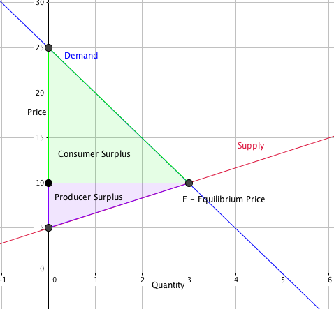
In the sample market shown in the graph, equilibrium price is $10 and equilibrium quantity is 3 units. The consumer surplus area is highlighted above the equilibrium price line. This area can be calculated as the area of a triangle.
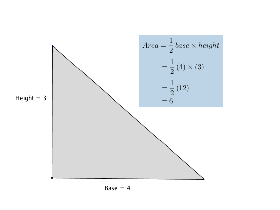
Recall that to find the area of a triangle, you will need to know its base and height. Refer to the following example if you need a refresher.

Let’s apply the calculation for the area of a triangle to our example market to see the added value that consumers will get for this item at the equilibrium price in our sample market.
Step 1: Define the base and height of the consumer surplus triangle.
The base of the consumer surplus triangle is 3 units long. Be careful when you define the height of this triangle, it is tempting to say it is 25, can you see why it isn’t? The height is determined by the distance from the equilibrium price line and where the demand curve intersects the vertical axis. The height of the triangle begins at $10 and ends at $25, so it will be $25 – $10 = $15
[latex]b = 3[/latex]
[latex]h = 15[/latex]
Step 2: Apply the values for base and height to the formula for the area of a triangle.
A = [latex]\frac{1}{2}b\times h[/latex]
A = [latex]\frac{1}{2}3\times 15[/latex]
A = [latex]\frac{1}{2}45[/latex]
A = [latex]\frac{45}{2} = 22.5[/latex]
Try It
Try It
This next question allow you to get as much practice as you need, as you can click the link at the top of the question (“Try another version of this question”) to get a new version of the question. Practice until you feel comfortable with this concept.
[ohm_question sameseed=1]154873-154874-154875[/ohm_question]
Glossary
- deadweight loss:
- the loss in social surplus that occurs when a market produces an inefficient quantity
- producer surplus:
- the value to producers of their sales above their cost of production
- social (or economic or total) surplus:
- the sum of consumer and producer surplus at some quantity and price of output

