26 Visual Aids
By Sheila Kasperek, MLIS, MSIT
Mansfield University, Mansfield, PA
LEARNING OBJECTIVES
After reading this chapter, you should be able to:
- Identify when and how visual aids will enhance a presentation
- Identify the different types of visual aids
- Identify effective and ineffective use of visual aids
- Apply basic design principles to slide design
- Identify best practices to incorporating visual aids in a presentation
Chapter Outline
- Introduction
- Effective Visual Aids
- Types of Visual Aids
- Personal Appearance
- Objects and Props
- Demonstration
- Posters and Flip Charts
- Audio and Video
- Handouts
- Slideware
- Design Principles
- Slide Layout
- Backgrounds and Effects
- Colors
- Fonts
- Text
- Images
- Graphs and Charts
- Implementation
- Visual Aid Tips
- Conclusion
- Review Questions and Activities
- Glossary
- References
Introduction

“Grifo mágico” by emijrp. CC-BY.
“I know you can’t read this from the back there,” the presenter apologizes to a screen so full of words you would think the entire speech had been crammed into one slide. This is just the first of a seemingly endless string of slides I can’t read, charts so full of numbers I can’t decipher the meaning, and clip art so clichéd I can’t help but roll my eyes and sigh. It is not long before I’m presented with an incredibly dense graph I can’t make any sense of since he keeps interrupting my concentration with actual talking. “When is he going to come to the point already?” I think to myself as I start to doodle in the margins of the handout of the PowerPoint slides for the very talk I’m currently sitting through. Why did he even bother with a presentation? He could have just emailed us all of the handout and saved us from this painful, dull spectacle. As he reads from his slides and belabors his statistics, my mind drifts to grocery lists and the upcoming weekend. I can think of a hundred better uses for an hour.
It seems nearly impossible to see a presentation that doesn’t revolve around a lengthy PowerPoint, so much so that you might think it was a requirement for giving a speech. The phrase “death by PowerPoint” was coined in response to the ubiquitous, wordy, and intellectually deadening presentations that focus on the slides rather than the content or the presenter. With the speaker reading directly from the slides, or worse, showing slides with text so small that it can’t be read, viewers are often left wondering what the need for the presentation is at all. A simple handout would convey the message and save everyone’s time. PowerPoint, however, is just one of the visual aids available to you as a speaker. Your ability to incorporate the right visual aid at the right time and in the right format can have a powerful effect on your audience. Because your message is the central focus of your speech, you only want to add visual aids that enhance your message, clarify the meaning of your words, target the emotions of your audience, and/or show what words fail to clearly describe.
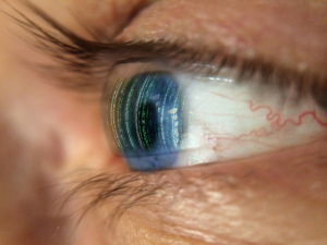
A visual image is a simple thing, a picture that enters the eyes. – Roy H. Williams

“mwdCyborgLenses” by em den. CC-BY-NC-SA.
Learning how to create effective visuals that resonate with your audience is important for a quality presentation. Understanding basic principles of how visual information is processed alone and in combination with audio information can make or break your visuals’ effectiveness and impact. Incorporating visuals into your speech that complement your words rather than stand in place of them or distract from them, will set you apart from other presenters, increase your credibility, and make a bigger and more memorable impact on your audience.

